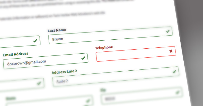
We are excited to release an upgraded form validation feature for WaiverFile! After discussing usability issues with a number of our customers, we were able to gather valuable feedback.
What did we learn?
We learned that some customers were not completing their waivers. In some locations, people would fill out the form but miss required fields. They tried to submit the form but did not realize that they missed something and continued on to join their group, but then had to go back to try again. Naturally, this created unneeded frustration.
This is why customer feedback is so important to us!
We were able to rework how we handle validation on all our waiver forms, and we are excited that this improved feature is now available on all WaiverFile sites.
What was improved?
We realized that customers needed visual cues throughout the form completion process, and most importantly, a space that tells users clearly that their form was not complete when they try to submit. So we added both. Our new form validation system will check each field as users complete their waiver, and mark each field with a green checkmark as they move along. If they miss something and try to submit the form, they will see any fields that are incomplete listed in red.
What about mobile devices?
Form completion on phones was one of the more common areas where people had trouble. The new form validation is carefully designed so that entry is as smooth as possible on any device, including mobile phones where screen real estate is minimal.
Thank you to our customers!
We would just like to say a big thank you to all our customers who took the time to report these issues to us! This real world information helps us continue to shape and grow WaiverFile into the best waiver solution available - THANK YOU!
